Product design · CU Boulder
Making student resources findable
Student Affairs was writing genuinely useful articles. They were going out by email, where almost nobody read them.
jump to the solutionContext
Delivering content where students already are
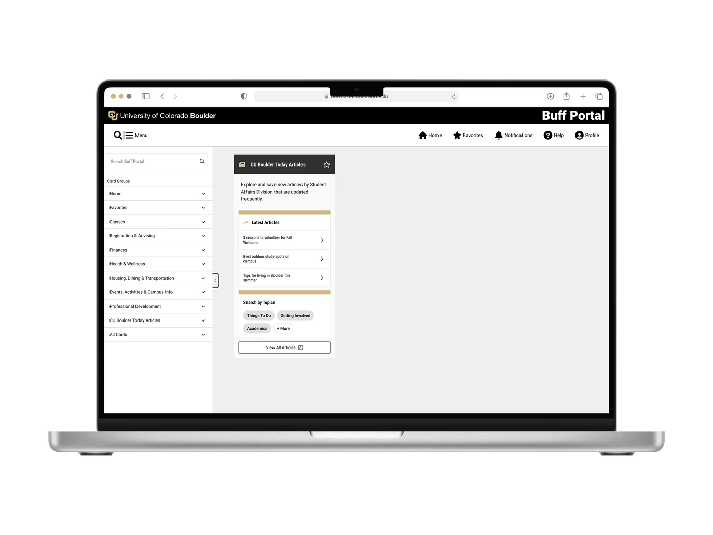
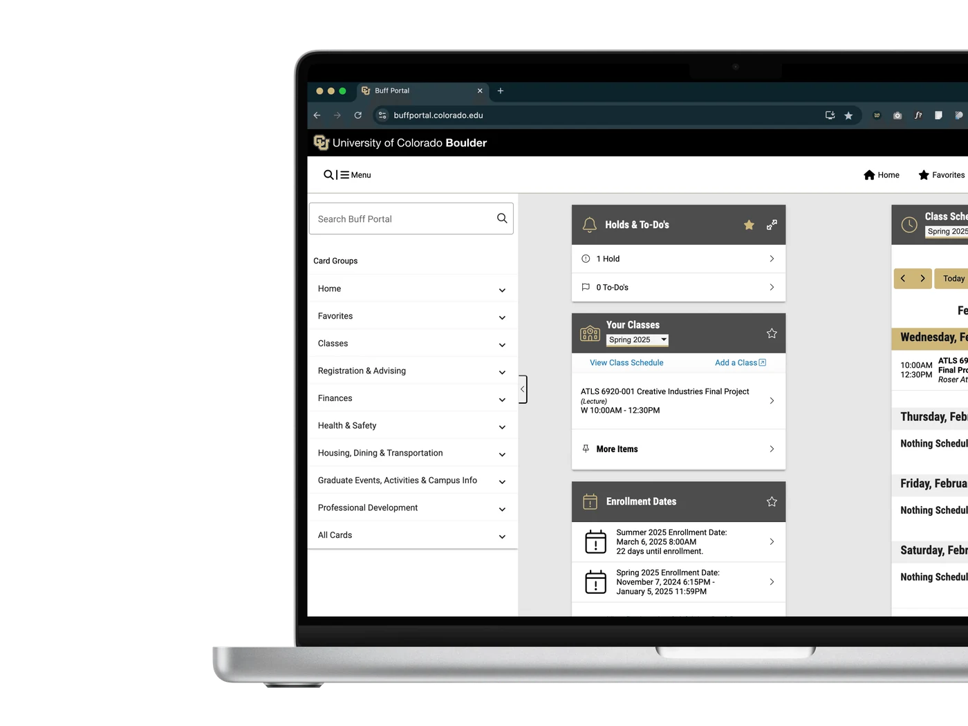
CU Boulder's Student Affairs team publishes content on academics, wellness and campus life. Distributed through campus email, it had low visibility and lower engagement. The task was to integrate it into Buff Portal, the dashboard students already open for schedules, grades and financial aid.
This was a fast-paced project: collaboration, rapid prototyping and usability testing inside a short window.
The problem
Low visibility, and no reason for a student to look
Students were not ignoring these resources because the resources were bad. They were ignoring them because they were buried in an inbox, underneath content that was not relevant to them, with nothing tying an article to what that particular student was actually dealing with.
Desired solution: put the articles inside Buff Portal, where students already go, without disrupting what they came to do.
Project goals
Three things the integration had to achieve
User research
Co-designing with 16 students rather than designing at them
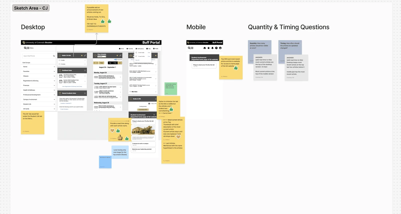
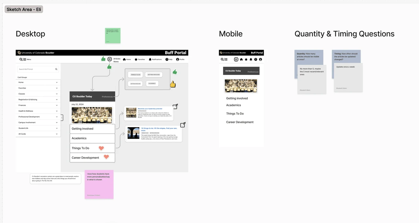
With a limited timeframe, the fastest way to good ideas was to get them from the people who would use it. I moderated a collaborative session with 16 CU Boulder students, supported by the Buff Portal UX team.
Wireframing
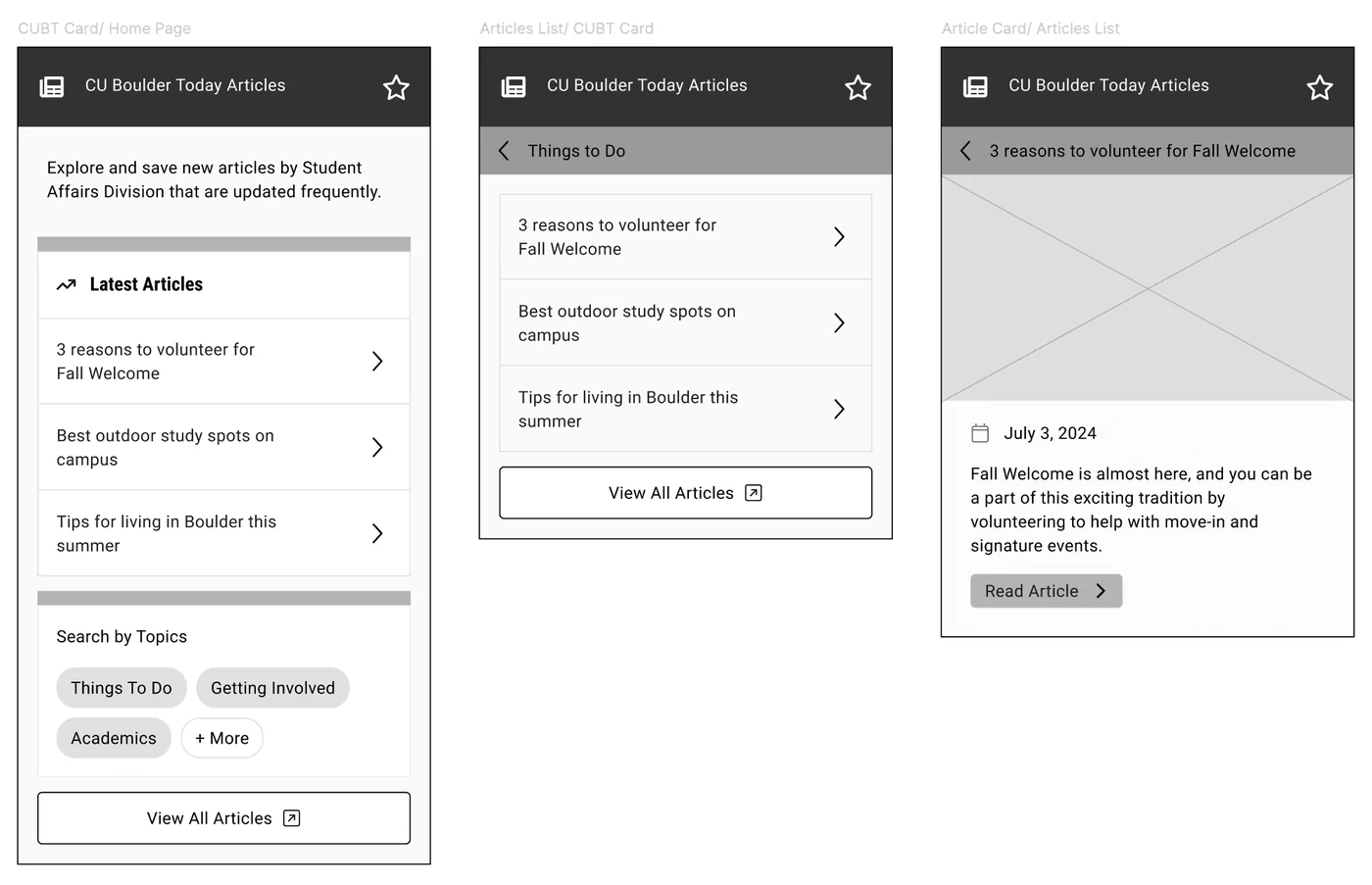
Two directions, built to be tested against each other
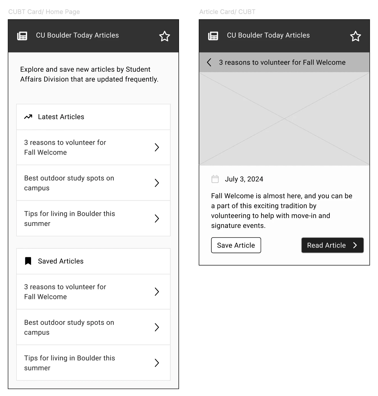
The initial wireframes outlined structure and flow, and went through several iterations. Rather than converge early, we deliberately carried two distinct versions forward so students could react to a real choice.
Final prototypes
Extending the existing system, not bolting onto it
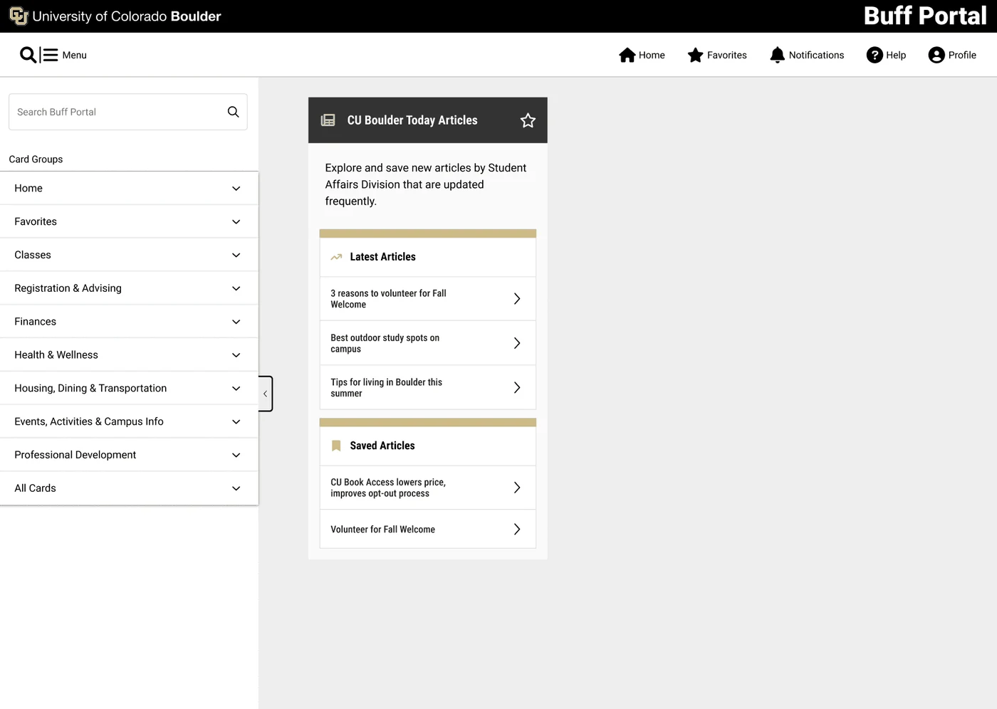
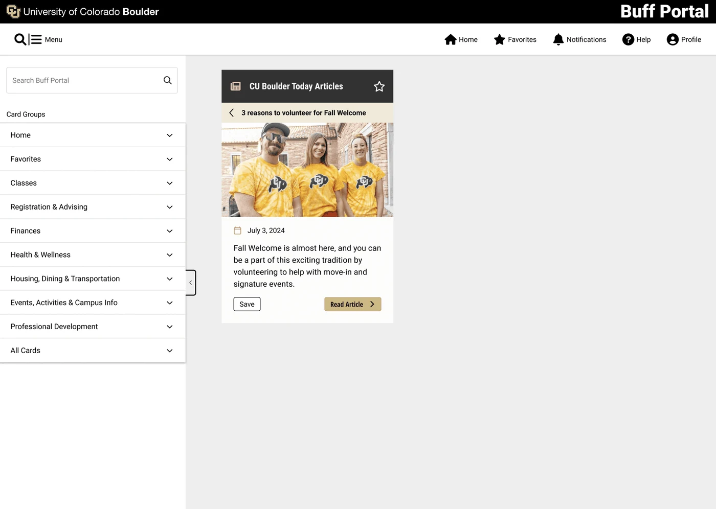
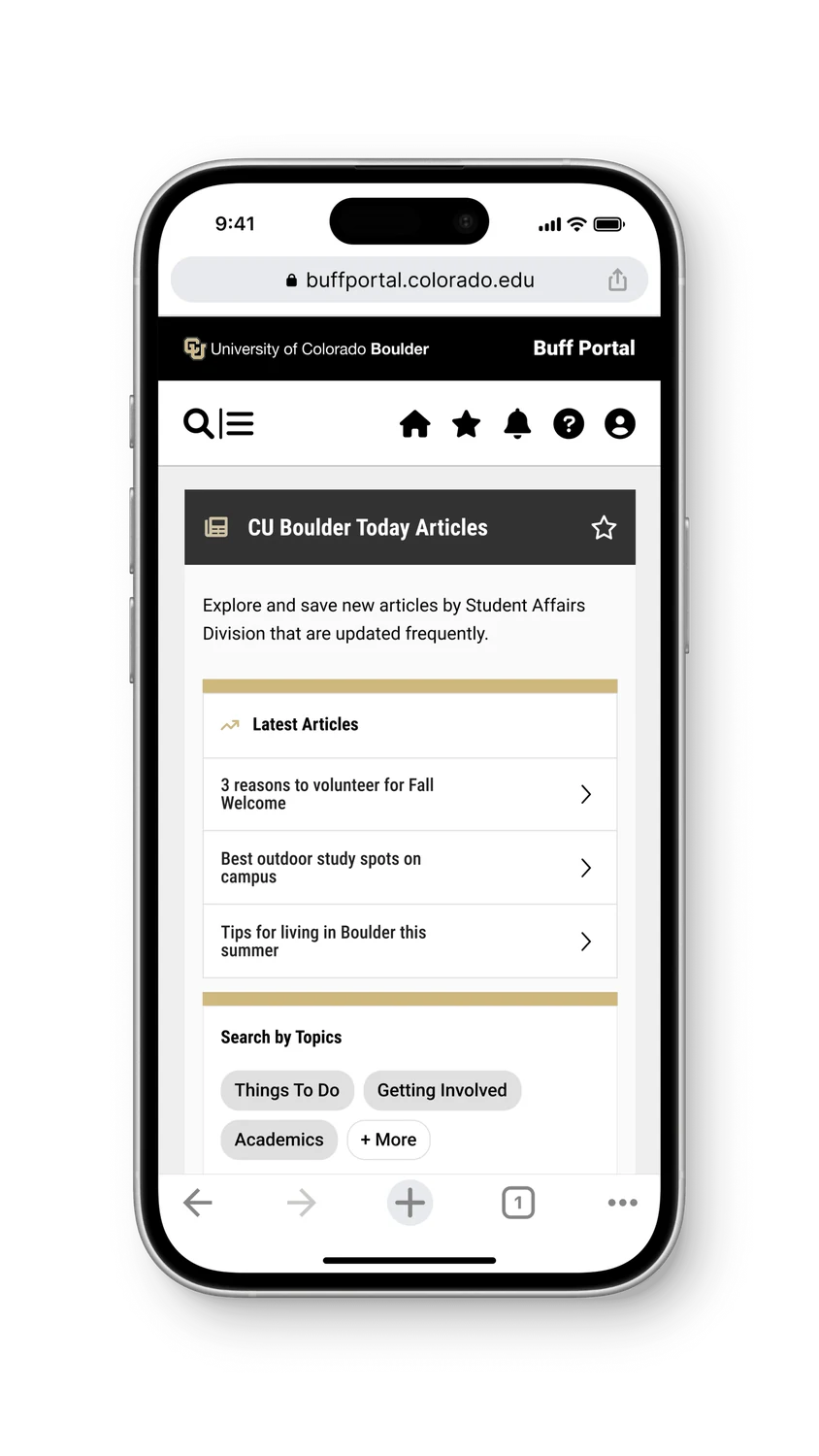
Both high fidelity versions followed Buff Portal's existing design framework, while adding components to the shared library that other teams could reuse afterwards. Integrating into an institutional product means your work has to survive the next person's feature.
User testing
A second round of feedback on the real prototypes
We ran remote testing over video, walking students through the working high fidelity prototypes and noting what they did as well as what they said.
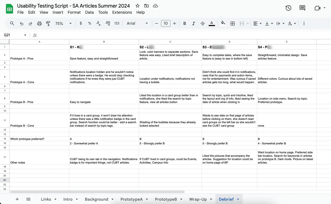
Every comment went into a structured table, then got analysed to identify which version students preferred and what still needed changing. Two rounds of student input, at the idea stage and at the prototype stage, is what made the recommendation defensible.
Reflection
What this project taught me
The instinct on a visibility problem is to make the thing louder. The better answer was to move it somewhere it made sense, and to let students tell us where that was. Sixteen people sketching for an hour produced more usable directions than I would have reached alone in a week.
Working inside an established institutional design system was the other lesson. Adding to a shared component library, rather than designing a one-off, meant the work kept paying off after the project ended. It is the same reason I now build component libraries rather than screens.