Bridging the gap between people seeking guidance and people offering it
Mentorship matters for personal and professional growth, but finding the right mentor is unreasonably hard. Guidr connects mentees and mentors across fields based on mutual interests, challenges and goals, while keeping the interaction safe and the commitment realistic.
I managed the entire design process for this product, from user research and product strategy through interaction design, visual design and branding. The project split into two sides, mentees and mentors. This case study follows the mentee side.
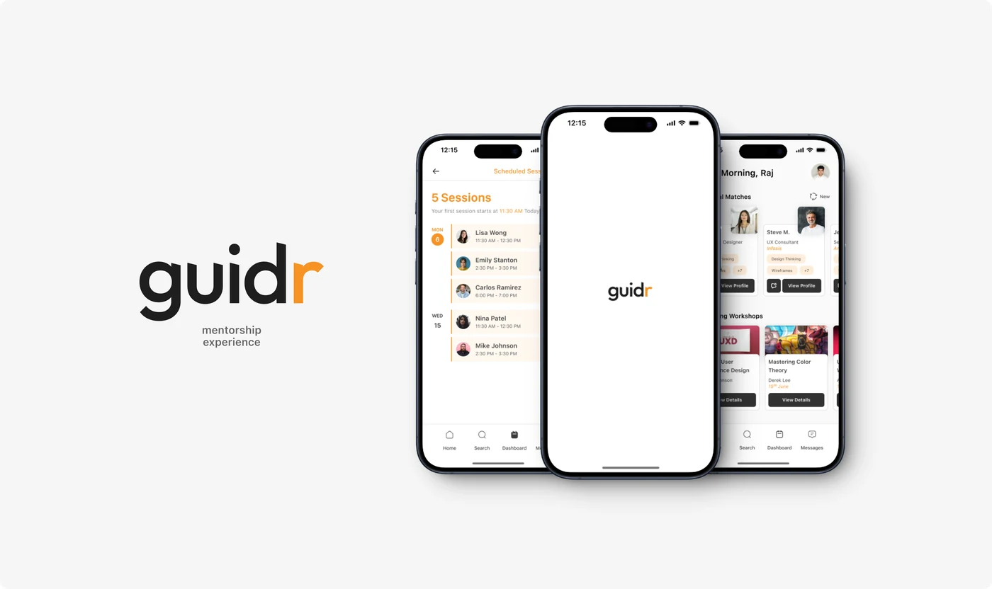
Guidr. Brand and product designed together, since one person was doing both and the app had to feel like something a student would actually open.
Role
Product Designer, end to end
Timeline
March to July 2024
Focus
Research, strategy, interaction and visual design, branding
Idea synthesis
It started at career development panels
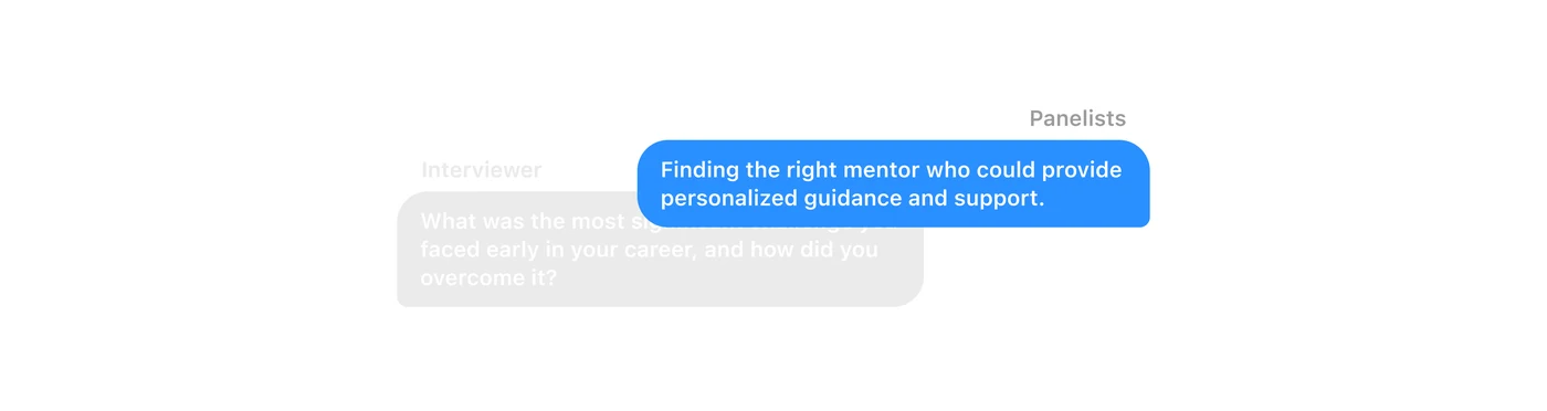
Across every panel I attended, one question kept coming up: what was the biggest challenge you faced early in your career, and how did you get past it? The answer kept repeating. People found someone who had already been there.
That is a solvable problem, and the existing tools were not solving it.
The problem
Many incomplete solutions make it harder for students to find their community
Partial solutions exist, but each one puts a different barrier in front of someone looking for a mentor. Together they add up to a search that most students give up on.
LinkedIn connections
A professional network that connects people to wide-ranging industry contacts.
Pros
Wide network
Professional profiles
Cons
Hard to find specific mentorship
Generic advice
University platforms
Official channels provided by institutions to support student needs.
Pros
Official and reliable
Cons
Limited information
Difficult navigation
Weak search
Mentorship programs
Structured initiatives designed to provide goal-oriented guidance.
Pros
Structured and goal-oriented
Cons
Limited availability
Little personalisation
Product goal: one place where finding a mentor who matches your interests is easy, personal and trustworthy.
User research
Twelve interviews, then an affinity map
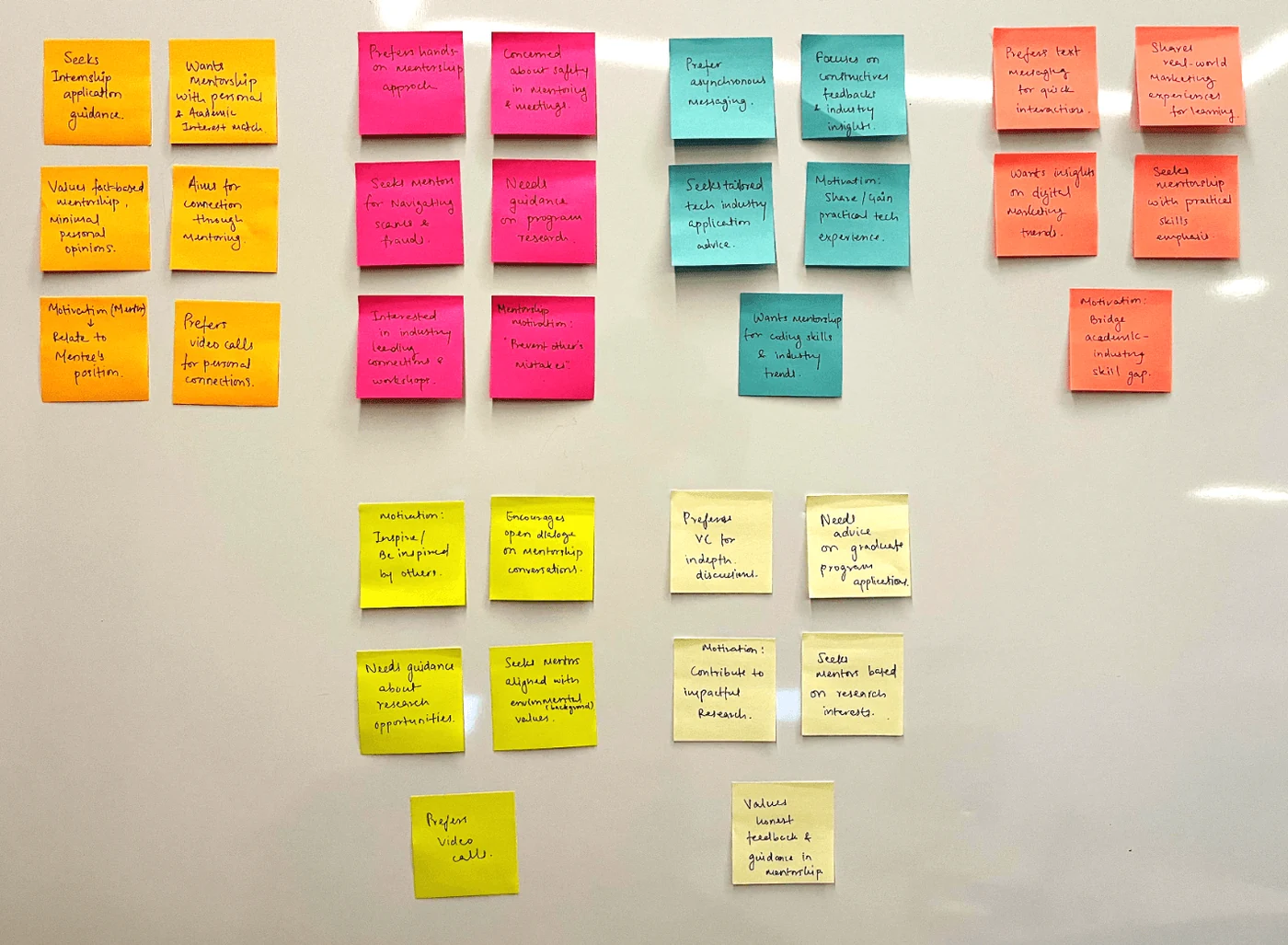
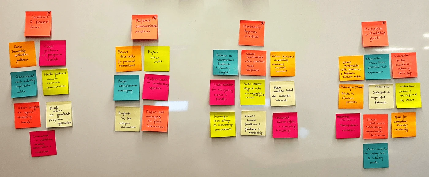
We ran in-depth qualitative interviews with twelve potential users, students and professionals from a range of academic and career backgrounds, over video calls. Afterwards we built an affinity map to find the themes that repeated.
01Personalised guidance. People want mentors matched to their specific academic and career interests, not a general directory.
02Flexible communication. Video calls, messaging and in-person all had takers. Forcing one channel loses people.
03Safety and trust. Users needed confidence the connection was real, to avoid scams.
04Skill development. The useful mentorship offered practical advice and project collaboration, bridging academic and real-world skills.
05Community. People wanted peers with the same goals, not only a mentor above them.
Affinity map. Every observation from twelve interviews on its own note, then grouped until the groups stopped moving. The themes that survived became the design questions.One cluster, close up. Safety and trust ran through more notes than any other theme. People were not short of ways to contact a stranger. They were short of a reason to believe the stranger was real.
Framing
Turning insights into How Might We questions
The affinity map gave us themes. How Might We questions turned those themes into design problems we could actually solve.
How might we
Create a personalised matching system that aligns mentors and mentees on academic and personal interests, career goals and preferred communication methods?
How might we
Provide guidance for common obstacles like internships, career planning and adapting to new environments, alongside tailored advice for specific challenges?
How might we
Build in tools that support skill development: project collaboration, feedback, and access to workshops and talks by people working in the field?
How might we
Create a community that encourages open dialogue and shared experience, particularly for users with specific interests like sustainability or technology?
Product constraints
Deciding what the app was not going to be
Designing the main flow meant keeping it straightforward for first-time users. Naming what the product refused to do was the fastest way to keep the flow honest.
The app is
For connecting users with mentors who share their goals
Built to keep interactions secure and trustworthy
Flexible about communication, with minimal time commitment
The app is not
A general networking or job search tool
Dictating specific career or academic choices
Requiring extensive planning or preparation
User flow
Crafting an intuitive path for a first-time user
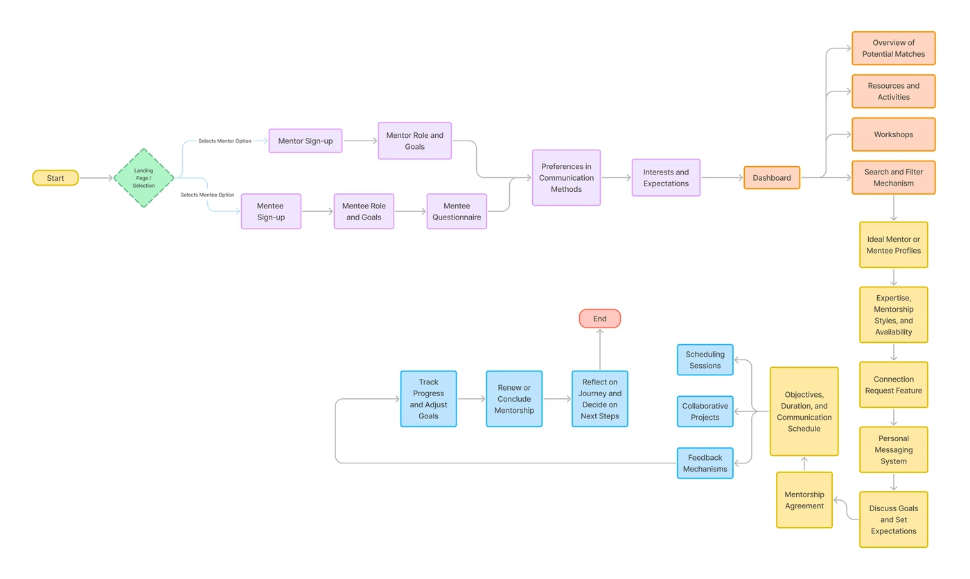
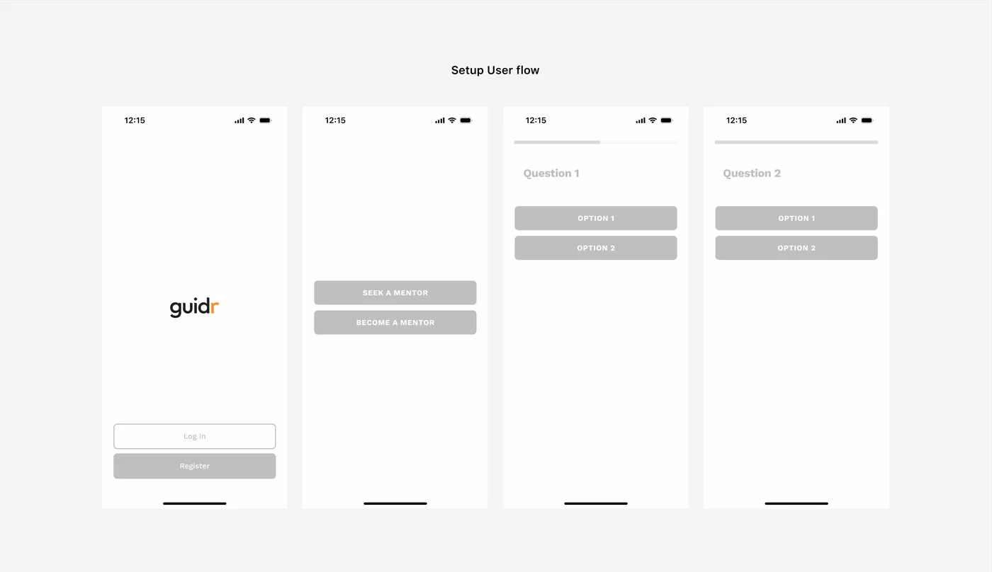
The flow had to hold for someone who had never opened the product and was not yet sure they wanted a mentor. Drawing it end to end is what showed the sign-up sequence ran three screens longer than the motivation would survive.
The flow. Sign-up, goal, interests, matches, profile, first message. Anything that did not move a mentee closer to sending that first message came out.
Wireframing
Structure before surface
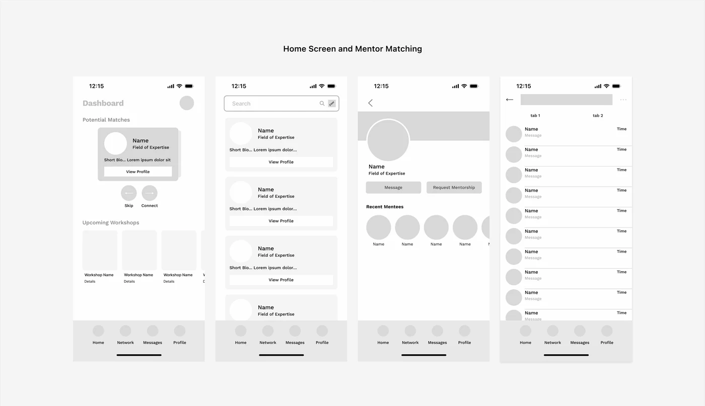
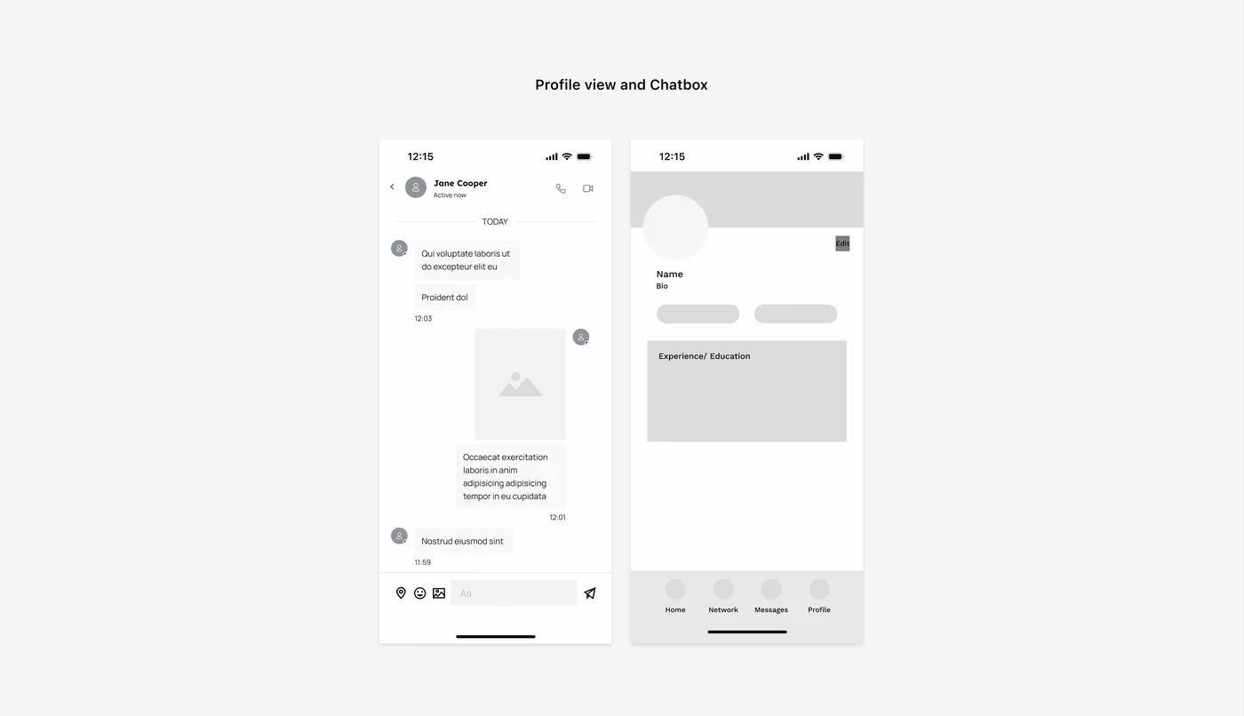
The initial wireframes outlined structure and hierarchy, and went through several rounds before any visual treatment was applied.
Onboarding. Splash, goal, interests. Each screen asks one thing, because a long form at the front door is where products like this lose people.Search and browse. Filters kept shallow on purpose. A student who has to configure a search has already given up.Profile and shortlist. The profile has to answer one question above the fold: is this person likely to reply to me?
Visual design ideation
Icons made the onboarding readable
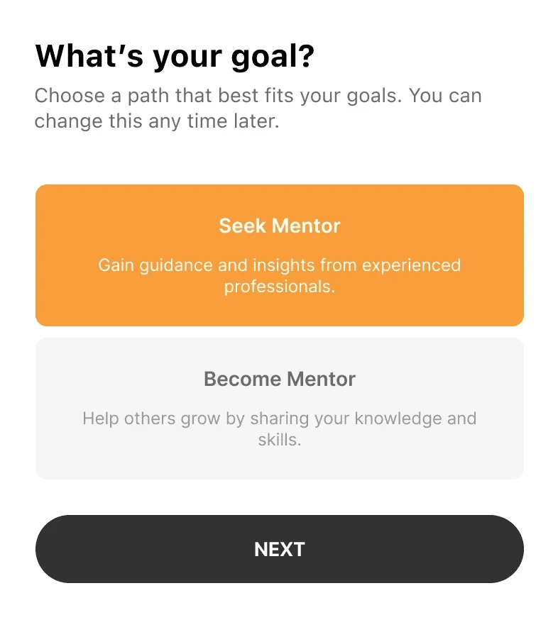
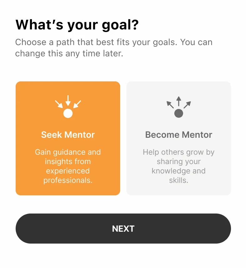
The onboarding questions started as text options with one-line captions. Content felt crowded and the two roles were easy to confuse.
Adding icons to distinguish the mentor and mentee roles made the layout immediately more scannable. It is a small change that decided whether the first screen worked.
The fix was not more copy. It was giving the two choices different shapes.
Before. Two options as stacked text blocks of near-identical length and weight. Content feels crowded, and the choice has to be read rather than seen.After. An icon above each option gives the two roles different shapes. The choice reads at a glance, and the copy becomes confirmation rather than the only signal.
Interaction design
Helping the first message actually get sent
The hardest moment in any mentorship product is the first message. People stall, not because they do not want help, but because they do not know how to open.
The chat screen includes an AI-powered conversation starter that generates personalised prompts from both profiles and their shared interests, so the blank box is never the first thing a mentee faces.
Conversation starter. An opener generated from what the two profiles have in common, offered above the input. Accept it, edit it, or ignore it, but never face an empty box.
Final designs
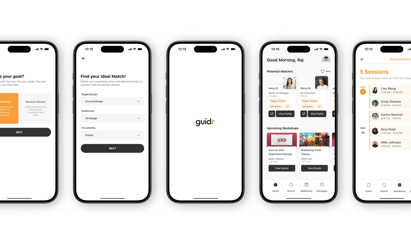
The high fidelity mentee experience
The mentee experience. Sign-up, goal, brand moment, mentor home, matches. Five screens from install to a mentor you could message, which was the whole constraint.
Tone. The illustration style was chosen to make the product feel like a conversation between people rather than a directory lookup, which is what everything students already had felt like.
Reflection
What this project taught me
Guidr was the first product I took from a question at a career panel all the way to a working high fidelity prototype, on my own. The research was the part that changed the outcome most: without the twelve interviews I would have built a directory, and a directory was exactly what people already had and were not using.
The other lesson was about constraint. Writing down what the app was not going to be kept the flow short enough that a first-time user could finish it. That instinct, decide what to leave out before you design what to put in, is the one I use most often now.